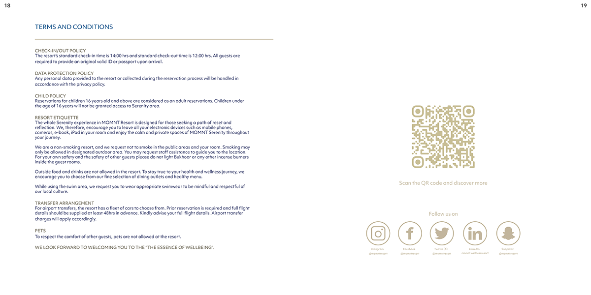
Overview:
MOMNT is a fictional wellness retreat created to help guests disconnect from the digital world and reconnect with the present moment through nature, stillness, and self-awareness. This 20-page, square-format brochure was designed to express the retreat’s core philosophy: being fully present in the moment.
Design Approach:
The brochure’s visual identity embraces quiet simplicity. The layout is clean and spacious, guiding the reader gently without overwhelming them—mirroring the retreat’s peaceful atmosphere. Every element is intentional, meant to slow the pace and invite reflection.
Fonts & Color Choices:
Typography: A refined sans-serif typeface in a deep navy (nearly black) creates a sense of grounded elegance and modern calm.
Color Palette: Light tan tones form the backdrop, chosen for their warmth and earthiness, evoking sand, sunlight, and serenity. The palette creates a natural, restorative atmosphere across each spread.
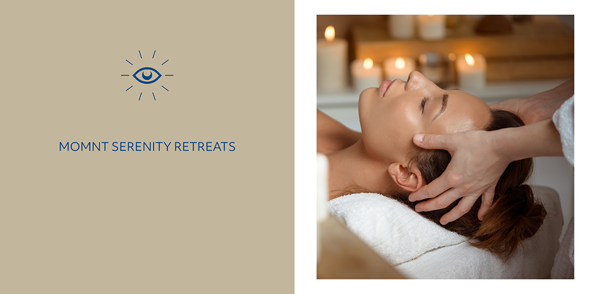
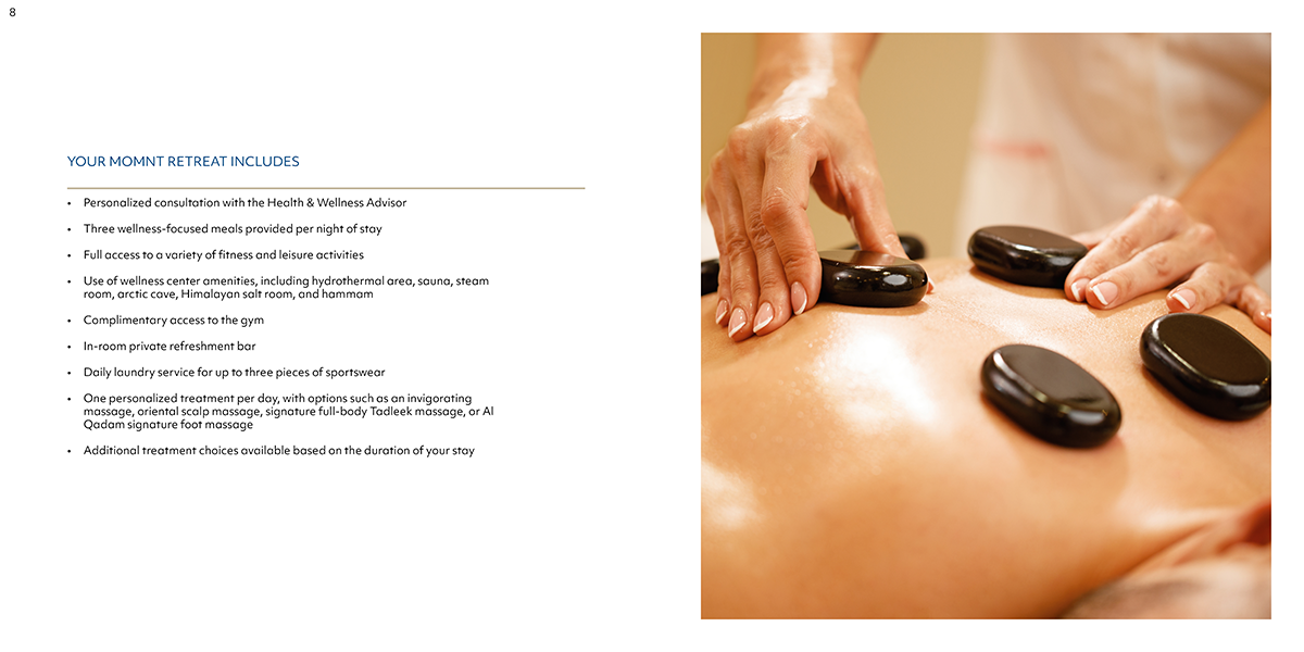
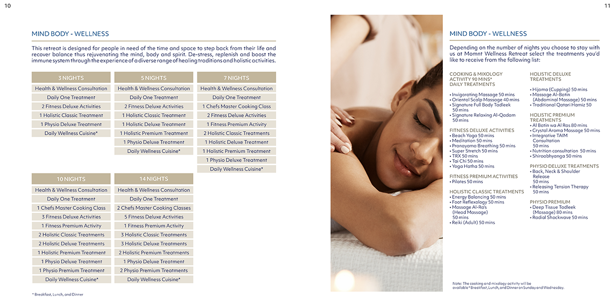
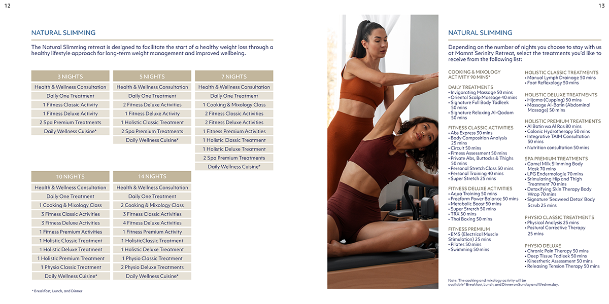
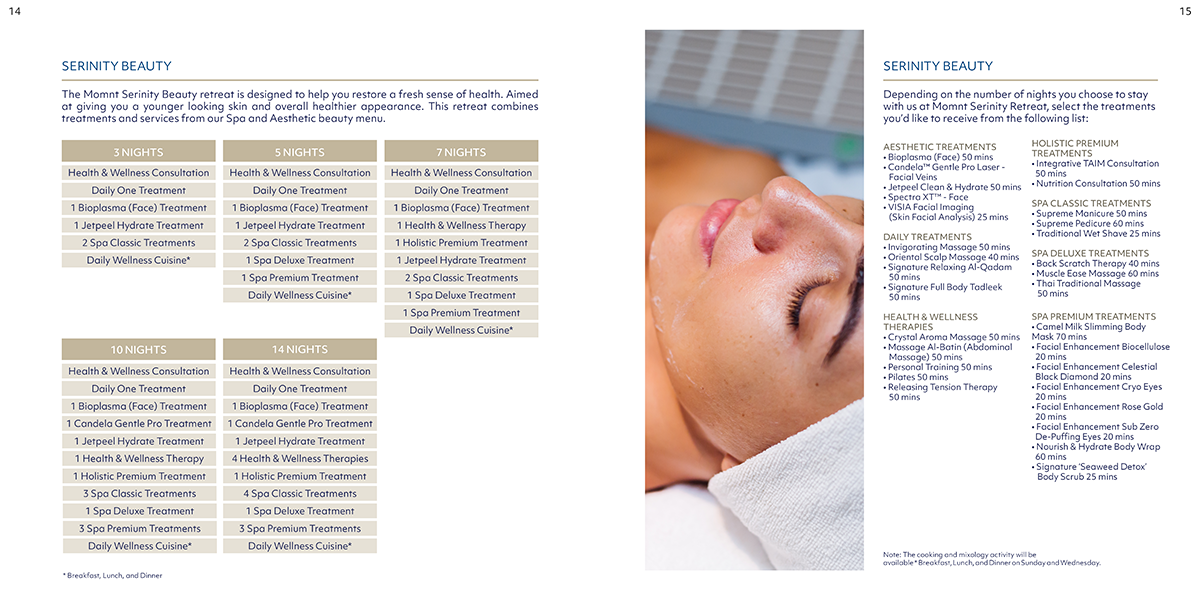
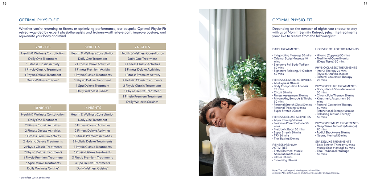
Imagery: Photography and textures were carefully selected to suggest openness, solitude, and connection to the natural world—quiet lakes, forest paths, open skies.
Logo Concept:
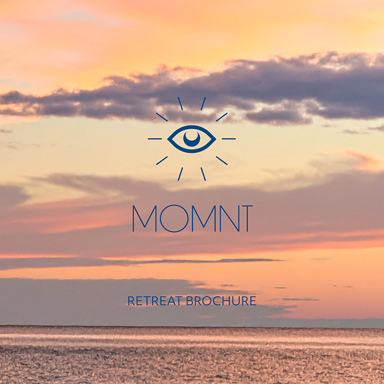
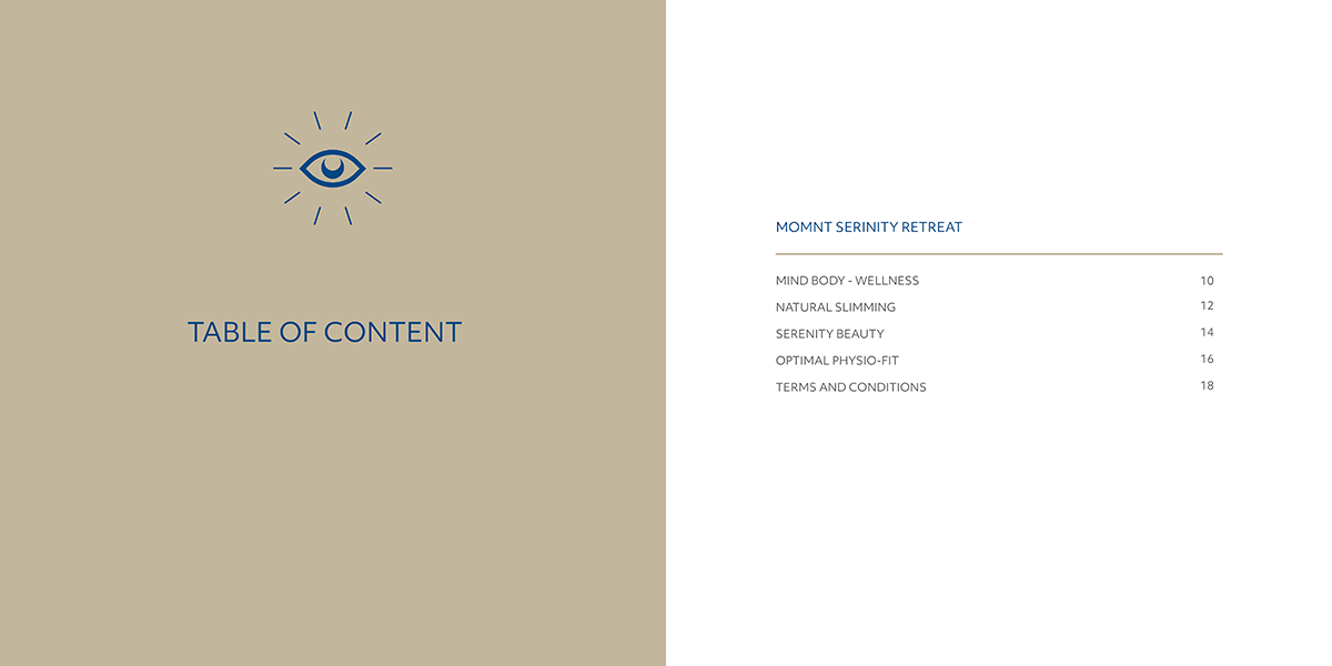
The custom logo for MOMNT features a single eye, symbolizing the third eye—a visual metaphor for inner vision and mindfulness. Surrounding the eye is a circular ring of evenly spaced dashes, suggesting radiating light. This dashed ring forms a complete circle, symbolizing clarity, wholeness, and continuous awareness. The overall mark is subtle yet intentional, communicating the retreat’s mission of expanding consciousness while remaining grounded in the present.
Goal:
This brochure was designed not only as a promotional tool but as a calming experience in itself—one that mirrors the journey of MOMNT: a retreat into clarity, simplicity, and presence.